CLASS-6
BAR GRAPH INTERPRETATION
BAR GRAPH INTERPRETATION -
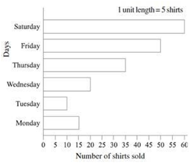
Example.1) Observe this bar graph which is showing the sale of shirts in a ready-made shop from Monday to Saturday.
Q.1) What information does the above bar graph give?
Ans.) The bar graph tells us the number of shirts sold on each day from Monday to Saturday.
Q.2) What is the scale chosen on the horizontal line representing number of shirts?
Ans.) The scale chosen on the horizontal line, that is, x axis is 1 unit length = 5 shirts.
Q.3) On which day were the maximum number of shirts sold? How many shirts were sold on that day?
Ans.) Since Saturday has the longest bar, maximum number of shirts was sold on Saturday. The number of shirts were sold were 60 X 5 = 300 shirts.
Q.4) On which day were the minimum number of shirts sold?
Ans.) Minimum number of shirts was sold on Tuesday. The number of shirts sold were 10 X 5 = 50 shirts.
Q.5) How many shirts were sold on Thursday?
Ans.) Thursday is represented by a bar of 35 units. Hence the numbers of shirts sold on this day were 35 X 5 = 175 shirts.
The following points should be noted while making a bar graph:-
· The bars should be rectangular and of equal width. The spacing between the bars should be the same.
· The bar graph should have a title.
· The x and y axes should be labelled showing what they represent.
· An appropriate scale should be chosen, and the scale should be mentioned.
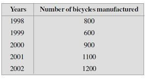
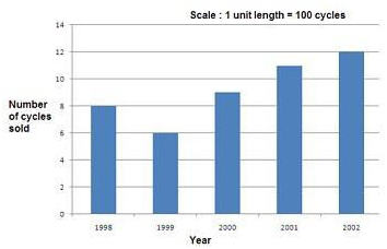
Example.2) Following table shows the number of bicycles manufactured in a factory during the years 1998 to 2002. Illustrate this data using a bar graph. Choose a scale of your choice.

Q.1) In which year were the maximum number of bicycles manufactured?
Ans.) The year 2002 is the year represented by bar with maximum height. Hence maximum number of cycles were sold in 2002, that is, 1200.
Q.2) In which year were the minimum number of bicycles manufactured?
Ans.) The year 1999 is the year represented by bar with minimum height. Hence minimum number of cycles were sold in 1999, that is, 600.
Example.3) A survey on 150 people was done to know 'What is their favourite ice cream?'
Ice-creams Vanilla Strawberry Chocolate Butterscotch
Flavour 40 20 60 30
The representation of the provided data will be as follows:
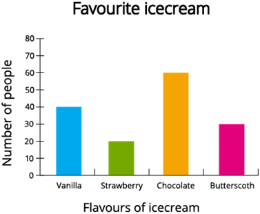
Since the data represented here is along the y-axis of the graph and the height of the bars gives the values, the above representation is the vertical bar graph.
The same simple bar graph can be represented in the horizontal axis as follows.
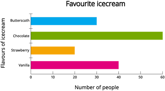
The data represented here is along the x-axis of the graph, and the length of the bars gives the values.
Also, it is clear from the above bar graphs that bars are of equal width and the spacing between the bars should be the same.
The title of the above bar graph is 'Favourite icecream'.
The x-axis and y-axis of the vertical bar graph are named as 'Flavours of icecream' and 'Number of people'. Similar way, the x-axis and y-axis of the horizontal bar graph are named as 'Number of people' and 'Flavors of icecream'.
For the vertical bar graph, the number of people considered from 0 to 70 with 10 points increments in each step along the y-axis. For the horizontal bar graph, the number of people considered from 0 to 70 with 10 points increments in each step along the x-axis.