CLASS-4
PICTOGRAPH - PIE CHART
PIE CHART -
A pie chart is a circular graph that is used to represent data in a visual form. The chart is divided into slices, each of which represents a proportion of the total data set. The size of each slice is proportional to the value it represents.
Pie charts are useful for displaying data in a way that is easy to understand and interpret, especially when the data can be broken down into discrete categories. They are commonly used in business and economics to represent market share, budget allocation, and other data that can be divided into discrete categories.
To create a pie chart, the total value of the data set must be determined, and then the percentage of each category is calculated. The percentage of each category is then represented as a slice of the pie chart. The chart is typically labeled with a legend that identifies each category and its corresponding color.
A pie chart is a type of chart that represents data as a circle divided into slices, with each slice representing a portion of the whole. The size of each slice corresponds to the proportion of the data it represents. Pie charts are commonly used to show proportions, percentages, or ratios of different categories or data points.
Pie charts are useful for quickly and easily showing the relative sizes of different data points or categories. They are often used in business, economics, and other fields to present data in a visual and easily digestible format.
To create a pie chart, data is first organized into categories, with each category represented by a slice of the circle. The size of each slice is determined by calculating the proportion of the total data that it represents. Once the slices are determined, they are labeled with the corresponding category or data point, and the chart is ready to be presented.
A pie chart is a type of data visualization that represents data in a circular graph, where each segment or "slice" of the pie represents a portion of the whole. The size of each slice is proportional to the quantity it represents.
Pie charts are commonly used to display data that is divided into categories or parts, such as market share, budget allocation, or survey results. The slices are usually labeled with the name or percentage of each category, making it easy for viewers to understand the relative sizes of each category at a glance.
Pie charts can be created using various software tools, such as Microsoft Excel, Google Sheets, or online charting websites. When creating a pie chart, it's important to choose appropriate colors and labels to make the chart clear and easy to understand. It's also important to avoid using too many slices or categories, as this can make the chart cluttered and difficult to read.
Uses of Pie Chart -
1. To represent the different fruits, games liked by a student in class.
2. To compare the statistical data of education, population among the cities, states, or countries.
3. Used to compare the profit, turnover in a business.
4. In school, pie charts are used to show the time allotted to each section, the grades of students in a form of percentages, etc.
Example.1) The Pie Chart given below shows the number of players in a Sports Academy who play different kinds of sports in INDIA.
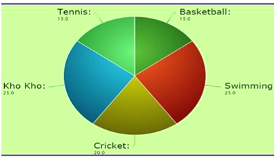
Study the Pie Chart and answer the following questions.
i) Make a table of the above pie chart.
SPORTS NO. OF PLAYERS IN DIFFERENT SPORTS
BASKETBALL 15
SWIMMING 25
CRICKET 20
KHO-KHO 25
TENNIS + 15
TOTAL 100
i) Which sports have the maximum number of players?
Ans: Swimming and Kho-Kho have the maximum number of players.
ii) Which sport is the second most preferred one?
Ans: Cricket is the second most preferred sport.
Example.2) The Pie Chart given below shows the number of milk bottle sold from a milk shop in different days of the week.
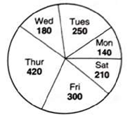
i) Make a table using the data given.
Ans.) DAYS MILK SOLD
Monday 140
Tuesday 250
Wednesday 180
Thursday 420
Friday 300
Saturday 210
ii) On which day the minimum number of milk bottles were sold?
Ans.) Monday
iii) On which day the maximum number of milk bottles were sold?
Ans.) Thursday
iv) What is the total number of milk bottles sold from Monday to Friday?
Ans.) 140 (Monday) + 250 (Tuesday) + 180 (Wednesday) + 420 (Thursday) + 300 (Friday) + 210 (Saturday) = 1500
v) What is the total number of milk bottles sold Tuesday and Thursday?
Ans.) 250 (Tuesday) + 420 (Thursday) = 670
Example.3) The pie chart shows the favorite subjects of students in a class.
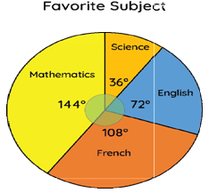
i) Which is the most favorite subject?
Ans.) Mathematics
ii) Which is the least favorite subject?
Ans.) Science
Example.4) Twenty children went to a fair.The following Pie Chart shows the number of items they had.
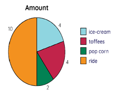
i) Make a table using the data given.
Ans.) ITEM NUMBER OF CHILD
Ice-Cream 4
Toffees 4
Popcorn 2
Ride + 10
20
iii) Which item was taken by maximum children? How many?
Ans.) Ride was taken by maximum children, that is 10
iv) Which two items were taken by same number of children?
Ans.) Ice-cream & Toffees
Example.5) The following pie chart shows the expenditure of a family.
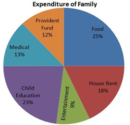
i) What is the title of the pie chart?
Ans.) Expenditure of family
ii) Make a table using the data given in the pie chart.
Ans.) Expenditure Percentage
Food 25%
House Rent 18%
Child Education 23%
Provident Fund 12%
Medical 13%
Entertainment 9%
iii) On what is the maximum amount of money spent?
Ans.) Food
iv) Which is the least expensive one?
Ans.) Entertainment
v) What is the total percent spent on house rent and medical?
Ans.) 18% (House Rent) + 13% (Medical) = 31%
Example.6) The given line graph shows the number of push-ups done by Roger in a week. Study the given line graph and answer the questions in full sentences.
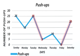
i) What is the title of the above line graph?
Ans.) Push ups
ii) Make a table of the line graph.
Ans.) DAYS NO.s OF PUSH UPS
Monday 15
Tuesday 25
Wednesday 5
Thursday 10
Friday 0
Saturday 20
Sunday 25
iii) On which days Roger did most push-ups? How many?
Ans.) Tuesday & Sundays, 25 each
iv) How many push-ups did he do on Friday?
Ans.) Zero (0), No push-up done on that day.
v) How many push-ups did he do in total on Monday and Thursday?
And.) 15 (Monday) + 10 (Thursday) = 25